Category Archives: News

Consumer Reports: California considers ads on car license plates

Facing a $19 billion deficit, California is seeking creative solutions to its budget shortfall. The state legislature is considering a program that would allow advertising on license plates, according to the Associated Press. The bill would require new, digital plates, with ads appearing in the space currently occupied by the familiar numbers and letters. The ads would only appear once the vehicle had been sitting still for four seconds.

Smart Plate, a San Francisco startup, is reportedly developing a digital license, though it does not have a model that is production ready.

A CNN story suggests that these plates could display paid advertising and public service announcements (PSAs). Further, the new plates could benefit the Amber Alert system, with notifications flashed on plates across the state to apprehend criminals. It’s conceivable, though, that some drivers may not agree or endorse an advertised product or PSA.

In a nation already overrun by advertising, and with distracted driving fatalities and injuries on the rise, it seems like a no-brainer to defeat such legislation that could only make our roads more dangerous.

And California, as opponents to the ads point out, already has some of the worst traffic jams in the country. It stands to reason that ads popping up on cars will only add to driver distraction.

I understand that desperate times call for desperate measures,  but it strikes me that this fanciful idea could create more problems than it solves.

What do you think? Post your thoughts and alternative suggestions in the comments below.

via Consumer Reports Cars Blog: Budget brainstorm: California considers ads on car license plates.

Posted in News | Tagged , , , , , | Leave a comment

Scented Billboard Stinks

From AAA reader David Z…

Scented Billboard

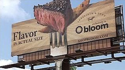
In Mooresville, N.C a highway billboard advertising steak sold at Bloom/Food Lion, a grocery store, does more than ruin the visual landscape. It wafts onto motorists the smell of cooking meat. That’s right, it’s a scented billboard.

From the local Fox News channel:


The scent is emitted by a high-powered fan at the bottom of the billboard that blows air over cartridges loaded with the BBQ fragrance oil, said Murray Dameron, marketing director for Charlotte-based ScentAir, which provides custom scents and fragrance-delivery systems for businesses, including hotel lobbies, casino gambling and retail stores.


“With all the advertising around, you wanna be able to jump out and really grab the consumer’s attention,” said Angie Hunter, a spokesperson for Bloom stores.

I guess Angie Hunter, nor the town of Mooresville, is concerned about the rights of individuals from having advertising messages forced on them (whether the message is visual or BBQ-scented). Is it time that new ordinances need to be drawn up by local governments regulating this sort of invasive advertising pollution?

via In Mooresville, N.C a highway billboard… – memyselfandhim.

Posted in News | Tagged , , | 1 Response

Paradigm Shift

These guys are literally in Boise, Idaho. Awesome.
Thanks Ed.

Posted in News | Tagged , | Leave a comment

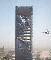
Illegal Supergraphic Ad Removed From Historic Hollywood Hotel

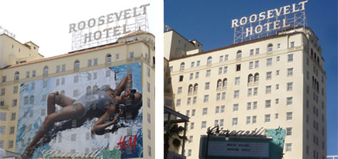
During his 2009 election campaign, City Attorney Carmen Trutanich promised to crack down on anyone putting up illegal billboards and supergraphic signs. Continuing to make good on that promise, his office has gotten the owners of the Hollywood Roosevelt Hotel to remove the latest in a series of illegal supergraphics that have covered the walls of the historic structure for the past four years.The sign removed advertised the Warner Bros. movie, “Clash of the Titans” and was installed last month by In Plain Sight Media. Most of the previous signs advertised H&M, a Swedish clothing company. A federal court lawsuit filed last year by the sign company and owners of the Hotel is still active.

via Unwrapped: Illegal Supergraphic Ad Removed From Historic Hollywood Hotel.

Posted in News | Tagged , | Leave a comment

‘Welcome ad’ not so welcome – baltimoresun.com

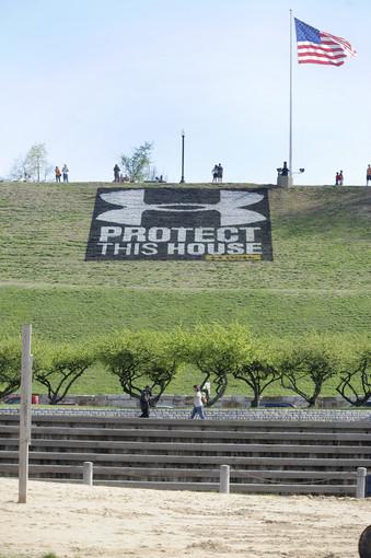
The huge Under Armour logo recently added to the hillside of Federal Hill Park to welcome volleyball players has angered some residents, who say the advertisement detracts from the aesthetics of the historic neighborhood.

“It’;s hugely disrespectful,” said Paul W. Robinson, president of the Federal Hill Neighborhood Association. Since the logo was added Thursday night, Robinson said, he has received about 40 phones call and at least as many e-mails from residents upset by the advertisement. Had the company paid for the display, Robinson said, he might think differently about the black-and-white graphic with the words “Protect this house” underneath.

read the whole story: ‘Welcome ad’ not so welcome – baltimoresun.com.

(thanks to reader sam!)

Posted in News | Tagged , , | Leave a comment

Movement Happening on Illegal Signs

March has been a bad time for illegal signs in LA. Finally Illegal Advertisers are going to jail.  Here’s info on some of the latest:

Posted in News | Tagged , , , , , , | Leave a comment

“Beer here!”: The Poster and the Public Notice in Rural Rwanda

The journey along Rwanda’s winding mountain roads is a bustling scene rural life, farm work, and commerce dotted with sparse, intermittent signage. In the most densely populated nation in Africa, advertising is thin. There are no shop signs or billboards. The looping eucalyptus and mud brick facades sporadically feature a lone 16″ x 20″ splash of color —very casually placed—which bears the dual message of “this is a shop” and/since “X is available for sale here.”

A beer poster on a shop outside of Kigali

The most prevalent of these signs is the blue-hued Primus beer postings, which frequent the storefronts — usually tacked onto the side, next to the door. Their informal treatment makes their display feel compulsory — approximating how a NYC restaurant might treat a department of health certificate. In the western city, the arrangement of ads is much more careful…and even hierarchical (it wouldn’t be amiss to say that they are arranged by money more than they are arranged by people; i.e. the most visible positioning = the most expensive slot.)  In this context, dispassion in arrangement is reserved for the strictly obligatory: the no smoking sign, the choking safety poster, the restroom sign. Refreshingly, all signs seem to get the same treatment in Rwanda.

The Primus beer signs in Rwanda are a strange player here. The sole vestige of western ad aesthetics complete with logotype, spot colors, copyright notice (all alien in this agrarian culture) — they are also utilitarian objects, dutifully pointing to the beer. “The beer is HERE!” This indexical function is immediately at odds with the western advertising’s tendency to disembody the brand from the object. Oftentimes, a NYC billboard will advertise a product that is practically unattainable in terms of the reasonable logistic measures. (Those showy 2003 Target billboards come to mind: the company consumed Times Square with ads before a store was open anywhere near Manhattan…much to popular annoyance.) The Primus ads sit [logically] at the nexus of consumer and beer, brand and product.

How does such a practical arrangement of signage become the exception rather than the rule? Why do these beer signs seem so weird?? For a better answer than can be provided here, I recommend looking at Susan Sontag’s essay, Posters: Advertisement, Art, Political Artifact, Commodity. In this 1970 essay, Sontag examines the assorted postings that cover the western city — distinguishing between the advertisement poster and the public notice.  While “posters” historically arose out of the tradition of the public notice, she considers them notably distinct in “presupposing the modern concept of the public – in which members of society are defined as spectators or consumers.”  Posters actively compete for the consumer: “the values of the poster are first those of ‘appeal’, and only second of information” while public notices “inform” – ostensibly conveying the straight facts on good authority.  The beer posters share qualities of each communication method- straddling Sontag’s definitions (in utilitarian defiance of western ad usage.) Although meant to stimulate commerce (or at least enable it) Rwandan shopkeeps’ deadpan use of the posters to point to the beer makes them function like an informative public notice — the tone of the communication is more akin to signage than appeal. The proximity of the notice to the goods bridges the brand to a physical product. It is a public notice… one that happens to lack the expected civic dimension and instead points to beer.

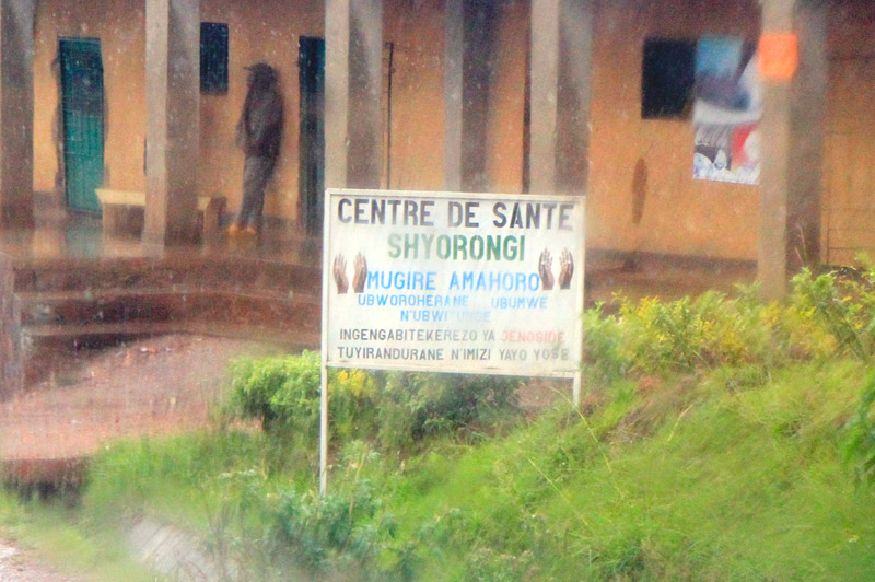
We drive for miles through farm villages without any signage at all – not even beer posters.  At set intervals, a different type of signage emerges as a repeating motif. Sober reminders of the 1994 genocide appear on the side of the road – rendered in uniform block-lettered hand-painted type on standard white posts.  Each sign shows a pair of hands in repose with text that bears the general message of “Genocide: Never let it happen again” (as roughly translated by our driver.) Here is the proper, traditional public notice: the sign with a civic message to a country which has literally hit the reset button on what “civic” engagement means.

To say that Rwandans had no other choice is an understatement — the country’s lone museum, the Genocide Museum, chronicles the ruin of a nation in horrifying detail. However, to say that they’ve had no choice also undermines the immense philosophical and political accomplishments of the people. It is impressive — even to the casual observer. One instantly picks up on a sense of “mass cooperation”: drivers yield to cars and pedestrians, strangers engage in polite conversation, Kigali residents excitedly discuss the city’s planned projects as if they were their own. Our driver enthusiastically chats with us about education reform, family planning initiatives, rural housing planning, urban street planning, and the political empowerment of women. There is virtually no crime to speak of. Everyone — right up to the nation’s president— is required to sweep their street once a month. They have more women in their Parliament than Sweden. Fifteen years after hitting “reset”, Rwanda is a nation of people wholly dedicated to civic enrichment — they are busy designing their future through policy.

The genocide street signs stand as a reminder of this sentiment — the genocide was a beginning for unity, rather than an end. Rather than serving as an authoritative mandate from an aloof government, its interpretation emanates from the people. It is the people’s sign, a symbol of unity. This is a public-notice-as-monument — reminding Rwanda’s public of their accomplishments and setting the tone for the new generation. The sign’s deadpan format belies the over-arching convictions of a nation singularly fixated on the future.

A more western ad campaign inside the capital city of Kigali…for cooking oil

Also posted in Articles | Tagged , , , , , | Leave a comment

On the difference between art and advertising

…even a really beautiful, ingenious, powerful ad (of which there are a lot) can never be any kind of real art: an ad has no status as gift, i.e. it’s never really for the person it’s directed at.

– David Foster Wallace, A Supposedly Fun Thing I’ll Never Do Again

And poached in this really amazing essay from Harper’s “The Ecstasy of Influence: A Plagiarism” by Jonathan Lethem which you should read immediately.

Posted in News | Tagged | 1 Response

Eugene Mirman on Marketing

Posted in News | Tagged , | Leave a comment

Dirty, Dirty, Dirty

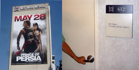
The supergraphic sign above for the movie “Prince of Persia” on a Westwood office building is legally permitted as an on-site sign, which the L.A. sign code defines as a sign directing attention to a product or service generally sold or offered on the premises where the sign is located. There is no movie theater in the Wilshire Blvd. building, or the offices of the movie production company, so how can the sign be considered legally equivalent to the sign on the local hardware store or dry cleaners?

For an answer, one most go back more than a decade, when Michael McNeilly (the self-proclaimed artist responsible for the giant statue of liberty images around the city) put one of the “Lady Liberty” images on the side of the building at 10921 Wilshire Blvd. He was charged by the city with putting up the supergraphic without a permit, as well as violating a local zoning prohibition on any such signs in the Wilshire corridor from Beverly Hills to Santa Monica.

While that case worked its way through the court, McNeilly changed the sign to one he claimed to be a memorial to the New York firefighters who died on 9/11 in the World Trade Center collapse. Again, he was cited by the city, and this time filed a lawsuit in federal court with the aid of the ACLU, which asserted that McNeilly’s First Amendment right to free speech allowed him to erect the sign without city interference. Two years later, then L.A. City Attorney Rocky Delgadillo agreed to a settlement of that lawsuit that allowed McNeilly to keep signs on the 12-story wall of the building, as long as those signs fit the city’s definition of “on-site” signs.

According to the settlement, only current tenants of the building with “bona fide office space” conducting “bona fide business” would be allowed to place messages on the signs. Furthermore, those tenants would have to provide proof to the city that they were conducting such a business by having an employee present during normal working hours.

Yesterday, we went to the office at mid-afternoon with a local community activist who has tried in the past to convince the city’s building department that the various signs that have been put up on the wall do not comply with those requirements. On the sixth floor, there was an office with the sign, “Sky Posters, a Creative Service Agency” beside the door. (Sky Posters is one of the terms used by McNeilly, who is president of a company called Skytag, Inc.) The door was locked, and knocks went unanswered. We spoke to a woman who was going into the office next door, and she said that in the four years she worked there she had never seen anyone enter or leave the Sky Posters office.

As we’ve pointed out in previous posts, McNeilly is a fraud. He claims to be an artist defending freedom of expression when the obvious fact that he is an entrepreneur making millions by putting up supergraphic signs wherever he can find willing property owners and then suing to block enforcement of the city’s ban on such signs. He has used one of the country’s most revered images—the statue of liberty—as a placeholder for signs hawking movies, TV shows, and other corporate products.

In 2008, he put up a huge “Lady Liberty” image on the opposite end of the Wilshire Blvd. building, and then sued the city in federal court and succeeded in getting a judge to order a preliminary injunction protecting it from city enforcement. Lady Liberty is long gone, of course, and now a Nike Ad featuring a 10-story image of Kobe Bryant greets pedestrians and motorists navigating the single most heavily-trafficked intersection in the entire city of L.A.

Nike ad featuring Kobe Bryant on east end of building. Credit: Curbed LA

Based on statements by media buyers and ad agency professionals, advertisers pay upwards of $100,000 a month for supergraphics like that in those kind of locations.

The “Prince of Persia” supergraphic on the west end of the building, visible from the 405 freeway almost half a mile away, made news two days ago when Curbed LA reported that the building owner was speaking out against a proposed development across the street that would block some views of the sign, including the one from the freeway. A statement, perhaps, on how valuable those views are for a sign that is “on-site” in name only.

via How Was This Eight-Story Supergraphic Ad For a Movie Permitted as an “On-Site” Sign?.

Posted in News | Tagged , , , , | Leave a comment

surfrider foundation: catch of the day. « shape+colour

Emailed to me by the great Andrew Boyd:

This is smart. Super smart. It’s getting more and more rare to see an actual, honest to goodness guerilla campaign that involves both a surprise and an insight tied together with a purpose. Slapping decals on the hand-rests of escalators just isn’t enough anymore.

To bring some attention to ocean pollution and just how disgusting it really is, Surfrider Foundation teamed up with Satchi & Satchi LA to create “Catch of the Day.” Simply and brilliantly, they collected actual trash from beaches around the U.S., packaged it like food, and left it on display at farmer’s markets. It’s site-specific, appropriate, impacting, meaningful, shocking, and an actual consumer insight into the very act they’re in the middle of. Someone about to buy fish from the same ocean as the trash in their hands can’t help but be at least a little more enlightened as to how pollution isn’t someone else’s problem.

see more pictures – surfrider foundation: catch of the day. « shape+colour.

Posted in News | Tagged | 1 Response

Owner Arrested For Hollywood Supergraphic Previously Cited For Sign Law Violations

Friday night’s arrest of Kayvan Setareh for allowing an 8-story supergraphic ad to be wrapped across three sides of an historic Hollywood building was not the first time the Pacific Palisades man has run afoul of the city’s sign code, according to building department records. In January, 2007, a citation was issued for an illegal supergraphic on the building at 6777 Hollywood Blvd, and In November, 2006, citations were issued for a total of four illegal supergraphics on another building owned by Setareh at 5858 Hollywood Blvd. As reported by the L.A. Times, the arrest of Setareh followed concerns that because there was no inspection of the gigantic ad’s attachment to the building it could come loose and cause injury to pedestrians and motorists in the busy street below.

via Owner Arrested For Hollywood Supergraphic Previously Cited For Sign Law Violations.

Posted in News | Tagged , , | Leave a comment

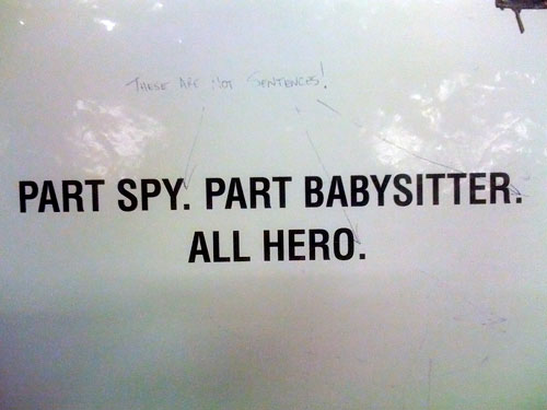
These Are Not Sentences!

manipulated advertising

Remember, it just takes one pen. Send us yours.

Seen in a subway station.

Posted in News | Tagged , , | Leave a comment

Vintage Ad Browser

Colt revolver

A site called Vintage Ad Browser has over 100,000 categorized advertisements from today all the way back to the 1840s. Categorized by type and date. A great resource for research. (tx @twhid)

Also posted in Reference Library | Tagged , , | Leave a comment

Advertisaphobia

keeping my privacy

Is there a word for the irrational and/or rational fear of becoming the target of direct marketers?

Advertisaphobia?
Adverphobia?
Adphobia?
Ad-phobia?

Posted in News | Tagged , , | Leave a comment