Category Archives: Articles

“Beer here!”: The Poster and the Public Notice in Rural Rwanda

The journey along Rwanda’s winding mountain roads is a bustling scene rural life, farm work, and commerce dotted with sparse, intermittent signage. In the most densely populated nation in Africa, advertising is thin. There are no shop signs or billboards. The looping eucalyptus and mud brick facades sporadically feature a lone 16″ x 20″ splash of color —very casually placed—which bears the dual message of “this is a shop” and/since “X is available for sale here.”

A beer poster on a shop outside of Kigali

The most prevalent of these signs is the blue-hued Primus beer postings, which frequent the storefronts — usually tacked onto the side, next to the door. Their informal treatment makes their display feel compulsory — approximating how a NYC restaurant might treat a department of health certificate. In the western city, the arrangement of ads is much more careful…and even hierarchical (it wouldn’t be amiss to say that they are arranged by money more than they are arranged by people; i.e. the most visible positioning = the most expensive slot.)  In this context, dispassion in arrangement is reserved for the strictly obligatory: the no smoking sign, the choking safety poster, the restroom sign. Refreshingly, all signs seem to get the same treatment in Rwanda.

The Primus beer signs in Rwanda are a strange player here. The sole vestige of western ad aesthetics complete with logotype, spot colors, copyright notice (all alien in this agrarian culture) — they are also utilitarian objects, dutifully pointing to the beer. “The beer is HERE!” This indexical function is immediately at odds with the western advertising’s tendency to disembody the brand from the object. Oftentimes, a NYC billboard will advertise a product that is practically unattainable in terms of the reasonable logistic measures. (Those showy 2003 Target billboards come to mind: the company consumed Times Square with ads before a store was open anywhere near Manhattan…much to popular annoyance.) The Primus ads sit [logically] at the nexus of consumer and beer, brand and product.

How does such a practical arrangement of signage become the exception rather than the rule? Why do these beer signs seem so weird?? For a better answer than can be provided here, I recommend looking at Susan Sontag’s essay, Posters: Advertisement, Art, Political Artifact, Commodity. In this 1970 essay, Sontag examines the assorted postings that cover the western city — distinguishing between the advertisement poster and the public notice.  While “posters” historically arose out of the tradition of the public notice, she considers them notably distinct in “presupposing the modern concept of the public – in which members of society are defined as spectators or consumers.”  Posters actively compete for the consumer: “the values of the poster are first those of ‘appeal’, and only second of information” while public notices “inform” – ostensibly conveying the straight facts on good authority.  The beer posters share qualities of each communication method- straddling Sontag’s definitions (in utilitarian defiance of western ad usage.) Although meant to stimulate commerce (or at least enable it) Rwandan shopkeeps’ deadpan use of the posters to point to the beer makes them function like an informative public notice — the tone of the communication is more akin to signage than appeal. The proximity of the notice to the goods bridges the brand to a physical product. It is a public notice… one that happens to lack the expected civic dimension and instead points to beer.

We drive for miles through farm villages without any signage at all – not even beer posters.  At set intervals, a different type of signage emerges as a repeating motif. Sober reminders of the 1994 genocide appear on the side of the road – rendered in uniform block-lettered hand-painted type on standard white posts.  Each sign shows a pair of hands in repose with text that bears the general message of “Genocide: Never let it happen again” (as roughly translated by our driver.) Here is the proper, traditional public notice: the sign with a civic message to a country which has literally hit the reset button on what “civic” engagement means.

To say that Rwandans had no other choice is an understatement — the country’s lone museum, the Genocide Museum, chronicles the ruin of a nation in horrifying detail. However, to say that they’ve had no choice also undermines the immense philosophical and political accomplishments of the people. It is impressive — even to the casual observer. One instantly picks up on a sense of “mass cooperation”: drivers yield to cars and pedestrians, strangers engage in polite conversation, Kigali residents excitedly discuss the city’s planned projects as if they were their own. Our driver enthusiastically chats with us about education reform, family planning initiatives, rural housing planning, urban street planning, and the political empowerment of women. There is virtually no crime to speak of. Everyone — right up to the nation’s president— is required to sweep their street once a month. They have more women in their Parliament than Sweden. Fifteen years after hitting “reset”, Rwanda is a nation of people wholly dedicated to civic enrichment — they are busy designing their future through policy.

The genocide street signs stand as a reminder of this sentiment — the genocide was a beginning for unity, rather than an end. Rather than serving as an authoritative mandate from an aloof government, its interpretation emanates from the people. It is the people’s sign, a symbol of unity. This is a public-notice-as-monument — reminding Rwanda’s public of their accomplishments and setting the tone for the new generation. The sign’s deadpan format belies the over-arching convictions of a nation singularly fixated on the future.

A more western ad campaign inside the capital city of Kigali…for cooking oil

Also posted in News | Tagged , , , , , | Leave a comment

30,000 feet, the final frontier

I’m on an airplane to San Francisco as I write this, we are somewhere over southern Nevada. but I will post it when I land. I wait, despite the fact that everyone on this flight was given a trial voucher for an in-air wifi service that is partnering with the airline I am flying on. I took the card I was given, and listened to the instructions on how to activate service: it requires creating an account, signing up for the monthly service, though it was ambiguous whether you had to input a credit card. The salesman walked around to everyone in the waiting area and asked them if they had a “wireless enabled device” with them, and then offered them a card with a code on it. He was typical gregarious on-foot salesman, who approached people fiddling with their iPhones and asked them if they had a wireless device, and followed that with “oh, well, yes, you do have one!” as if he discovered that in the process of talking to them, and not specifically targeted them because they so obviously were twiddling with their iPhones.

It was a special introductory offer. Normally it is $12.95 per flight, and I assume there is a monthly price as well for the permanently plane bound business travelers, and once they have your information, how hard is it to cancel or get out of the system. The salesman’s aggressiveness couched in friendliness had all the markings of classic corporate addiction creation. It was not unlike the real drug dealer, for whom the first hit is always on the house. It is a standard business strategy, but it doesn’t make it any less repulsive. Just remember AOL. Ever try to use their introductory offer, and then cancel after that free month, or maybe even a few more months; they practically would not let you. And then they call you and call you to get you to resume service

I knew almost immediately that I wouldn’t use the service; i felt like the corporate dealer was trying to make a user out of me, plus excessive registration processes repulse me, and even my junk email account is beginning to get overloaded. Also it was a 9AM flight, and I had only slept 5 hours. So I slept the first four hours, and woke up surrounded by people doing the same meaningless things that the internet is so useful for. I am pinned in by a guy in a speedy round of iPhone IM’ing that seems to never stop (his active arm needs room and he keeps elbowing me in the side), a guy who is playing WoW, and exhibiting all the signs of that form of addiction (though doesn’t he know that 5 hours is not long enough for a meaningful quest!), and a guy who is intently looking at something, though I can’t tell what.

I’m not about to argue that there is something sacred about plane travel, or that it is peaceful in any way, but it was one of the places where we were temporarily removed from the constant daily bombardment of information. If only for two or five or twelve hours, we did not see any advertisements, did not have to respond to urgent emails in our inbox, could not waste our time IM’ing or obsessively browsing eBay. This border has progressively deteriorated, most notably with the introduction of personal TV screens on the back of each seat, which allow a flight of people to all watch their choice of hundreds of stations. In my experience only two thirds of these screens actually turn off, the others you dim down to a lower setting but they will not turn off completely. Read More »

Posted in Articles | 1 Response

Murketing: Absolut international incident?

from R. Walker at Murketing:

Strange Maps, via The Plank:

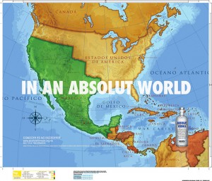
This map, used in a Mexican ad campaign, shows what the US-Mexican border would look like in an ‘absolut’ (i.e. perfect) world: a large part of the US’s west is annexed to Mexico.

Needless to say this map made its way to ‘El Norte’, annoying and upsetting many Americans – even leading to calls for a boycott of the Swedish-made vodka. What must be particularly annoying is that this map has some basis in fact.

The Plank also points to the reaction of someone named Michelle Malkin:

The advertising firm that created the Absolut Reconquista ad is Teran/TBWA. Teran is based in Mexico City. The company’s website boasts a pretentious statement of philosophy advocating “disruption” as a “tool for change” and “agent of growth.” (Scroll your mouse over the little buttons in the upper-right margin.) The firm advocates “overturning assumptions and prejudices that get in the way of imagining new possibilities and visionary ideas that help create a larger share of the future.”

Translation: The company advocates overturning borders that get in the way of imagining new maps of North America that help Mexico create a larger share of the continent.

Well. Two things.

First: An ad agency with a pretentious mission statement full of doublespeak clichés about change and disruption? No way! Say it isn’t so! That’s never happened before!

Second: Like every other agency, what these marketing pros “advocate” is getting paid by their clients. The way they get paid by their clients is to get their clients talked about and noticed. And that was Absolut-ly the goal here. Ad agencies don’t have a political motive. They have a profit motive.

Lifted entirely from R. Walker’s Murketing blog. (Thanks Rob!)

Also posted in News | 2 Responses

Article on Rami Tabello of IllegalSigns.CA

If you haven’t checked out IllegalSigns.CA yet, Rami Tabello is the man behind the removal of dozens of illegal billboards in Toronto.

From IllegalSigns.CA:

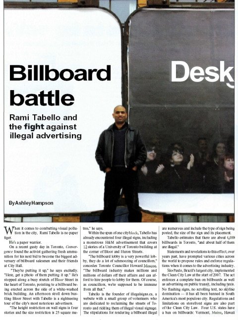
Humber College’s Convergence Magazine has published this article [PDF] about IllegalSigns.ca. It breaks a bit of new ground with the following quotes:

“The billboard lobby is a very powerful lobby,they do a lot of schmoozing of councilors,” concedes Toronto Councillor Howard Moscoe. “The billboard industry makes millions and millions of dollars off their affairs and can afford to hire people to lobby for them. Of course, councillors, we’re supposed to be immune from all that.”

“It’s turned the issue into a circus and has reduced the Toronto-East York community council into a council with a fetish about signs, rather than one dealing with development and other issues that are far more important than signs,” says Toronto City Councillor Kyle Rae.

Convergence Magazine Story

Also posted in News | Tagged , , | Leave a comment

Advertising Scofflaw Assaults NYT Reporter

From the New York Times’ David W. Dunlap, dated March 27, 2008:

The takeover of public space for commercial promotion may be offensive, but it is usually legal. Occasionally, however, it is not. On Friday, March 14, it bordered on the criminal.

That’s where I come in. I was the victim.

As a Times reporter, I tend to focus quickly on illegal marketing campaigns…. So I sensed a story on the evening of the 14th, when I came across two or three young men stapling posters for a new hip-hop album to lampposts, traffic signs and sidewalk scaffolding on Broadway, between 21st and 22nd Streets.

It is unlawful, the city’s administrative code says, for anyone to “attach or affix by any means whatsoever any handbill, poster, notice, sign” on lampposts, traffic signs and sign poles or “other such item or structure in any street.” signsThe sign-hanging team would place stacks of posters in wastebaskets at the street corners, then draw from that supply to cover nearby street fixtures.

I began photographing the poster operation. After about two minutes, one man asked me why I was taking pictures. “Because what you’re doing is illegal,” I replied. He answered, “Breaking cameras is illegal, too, but if you don’t stop taking pictures, I’ll break your camera.” He modified “camera” with an adjective I am not permitted to repeat here. I identified myself as a reporter from The Times. “I’ll break your camera,” he said, using that adjective again, “and you can print that in your paper.”

I distinctly remember thinking, “No, I can’t.” Then, rather than antagonize him further, I started taking pictures of the poster-covered scaffold pipes across Broadway.

The approach came so swiftly, I cannot even say whether it was from in front or behind. But I do remember a furious face inches away from mine as the man said he had warned me not to take any more pictures. The next few minutes are — as they say — a blur. I was suddenly on my back on the sidewalk, near the curb, trying to hold on to my camera and fend off my assailant, with my right leg pressed against his chest.

Read more…Illegal Signs and a Reporters Broken Camera – City Room – Metro – New York Times Blog

Note: Not to discourage you from trying to stop illegal advertising as it happens. Remember, when you see illegal ads call 311, if you see it happening in progress, call 911. It might seem extreme, but the laws for graffiti are extreme.

Also posted in News | Tagged , | 1 Response

Our Brands, Ourselves

Thanks to R.Walker, I came across the following post by Paul Lukas, who’s excellent ‘zine, Beer Frame, I discovered in my first year of college. Paul puts together some compelling arguments for keeping logos off team sports uniforms and in doing so, brings up some other interesting ideas about commercialism and our culture. His latest project, Uni-Watch, “deconstructs the finer points of sports uniforms in obsessive and excruciating detail” – the internet is an amazing place isn’t it? – Steve Lambert

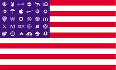
Corporate Flag.jpg

Two Sundays ago, Bryan posted this photo and complained about all the ACC logos visible therein. This led to a lengthy back-and-forth in the comments section about logo creep — mostly about swooshes and other maker’s marks, not about conference logos. The discussion, which I did not take part in (I was at a bar watching football and caught up on the comments later), featured several arguments and analogies that I hear again and again regarding logo creep — arguments that are, frankly, way off-base. Some similar arguments came up yesterday regarding Michael Jordan’s taped-over Adidas logo.

As you all know, I hate logo creep and see it as a symptom of a much bigger problem (i.e., the encroachment of advertising into public space). I know some of you feel differently, and I also know that to a certain extent this is generational: I grew up in an era when there were no manufacturer’s logos on uniforms; many of you have grown up in an era when such logos are ubiquitous. But even if we disagree on whether logo creep is a problem, we can at least try to keep the debate on a logical plane and not make straw man arguments or apples/oranges comparisons.

With that in mind, I’m going to try to address many of the arguments that came up two Sundays ago, along with some other arguments I frequently hear. I know some of you are tired of this topic, but you’ll have to deal with it for one more day — I wanted to get all my thoughts on the matter in one place, and that place is here.

Read More »

Also posted in News | Tagged | Leave a comment

“Real beauty” from the makers of Axe?

From our pal Carrie McLaren over at StayFree Magazine:

It’s been a while since we checked in on the Dove “Real Beauty” campaign, but I would feel remiss in not pointing out the new round of criticism its getting.

AxeIf you haven’t seen them, the Dove commercials are as genius as they are insidious (see Onslaught and Evolution, for instance). As the Campaign for a Commercial-Free Childhood pointed out last month, Dove is owned by Unilever, which also produces Axe body spray and other personal hygiene products. So while the makers of Dove attack advertising that exploits female bodies, they’re producing scores of those ads at the very same time. The Axe campaign, however, is particularly obnoxious. As media literacy consultant Bob McCannon has said:

In all my years of doing school workshops, I have never seen anything like the reaction of middle and high school kids. Almost ALL (no exaggeration) know the words to the Axe song, “Bom Chicka Wah Wah,” by heart and sing it immediately and enthusiastically with the video, and most of them have been to the Axe “spanking vixens” site.

Now someone has re-edited Dove’s latest commercial—replacing bikini bunnies from generic sources with those from Axe commercials—to call attention to Unilever’s hypocrisy. See A Message from Unilever. With luck, word will get around to all of those middle and high school teachers using the Dove spots as media literacy. The real lesson here is not that Dove supports “real beauty” but that corporations will say anything—even ostensibly critical things—to sell their crap.

Also posted in News | Tagged | 4 Responses

Playing Catch Up

It’s been quiet here for a while. I’ve been busy these past few weeks on a side project for Conflux. But more than that, a big new project with Packard Jennings (see Bus Stop Ad Project) has been taking up most of my time. It’s finally done and will be installed on Market Street in San Francisco in the beginning of November.

Since being so busy, some bits of relevant news have slipped by. Here’s a few to hold you over, with more to come in the near future…

Lobbying to Legalize Advertising
A year ago the Municipal Art Society and other community groups began to pressure the New York Department of Buildings to enforce existing laws that ban advertising on scaffolding construction sheds and construction sites. After realizing the fine/profit ratio was out of proportion, the DoB physically removed much of the illegal advertising.

An article in this weeks Village Voice explains that the DoB actually paid the advertisers to remove their own illegal ads. Also in the article: Outdoor Advertisers are heavily lobbying Melinda Katz, a Queens City Council member and candidate for City Comptroller, who has written legislation to make advertising on construction sheds legal. Worth reading.

By the way, Queens is home to another corrupt politician, showboat legislator, Peter Vallone Jr., who angles for votes by vilifying graffiti and advocating for disproportionate fines and jail time for writers. Queens, where’s the justice?

Locked Into A Bad Lease
Earlier this year two highway sized billboards were erected, one on top of the other, entering Greenwich Village in Manhattan. They reach higher than 3 stories, loom over housing, and have generally not been well received in the neighborhood. In a NY Times article, the landlord who had them installed expressed regrets:

”I personally want to unequivocally apologize for having made the decision to install the billboards,” he said in the statement. ”It was a business decision made without fully envisioning the sheer size of the signage and without understanding the emotional impact it would trigger.”

Mr. Achenbaum added, however, that he could not remove the billboards because he was ”bound to a long-term lease” with Sign In Properties, a signage company, for 20 years. Ms. Cohen added that if the hotel broke the lease, it would be contractually obligated to pay Sign In the projected lifetime revenue of the billboard, which she said would be a ”multimillion-dollar sum,” as well as the cost of the structure.

In his statement, Mr. Achenbaum also said that to make amends, he had offered to let artists display their work on the back of the billboards in the future, and to give those artists $5,000 grants. The program has not begun yet, according to Ms. Cohen, because Mr. Achenbaum must first secure city permission to display the works.

Ouch, that’s some lease. So the shortsighted landlord, thoughts clouded by greed, has had a change of heart. That’s nice. Sorta.

Also posted in News, Reference Library | Tagged , , , , | Leave a comment

Laws against billboards, how about wrap one?

There appears to be a new phenomenon of people being paid to “wrap” their cars in advertisements as a sort of moving billboard. (article see the article here) I had seen several flatbed trucks which had been outfitted with billboards on the back before, but I have not seen one of these cars yet. Maybe that is because I live in a place where huge SUV’s are essentially undriveable due to lack of parking. However, this struck me as crazy –

Nextel XB3M, which remains the largest producer of the material, uses an adhesive similar to the one on its Post-it notes, enabling installers to place vinyl strips on a vehicle that do not stick until pressure is applied. The material is popular for wrapping racecars, helicopters, planes, boats and even buildings. Far from hurting the paint job, the wrap preserves it.

The company either gives its brand ambassadors free cars or, more often, pays them as much as $800 a month. In the last seven years, FreeCar Media has hired about 7,000 motorists, who are instructed to park outside whenever possible, refrain from smoking, littering or swearing in their vehicle, and to attend a monthly influencer event where they hand out samples or coupons. They also have to send reports frequently with photographs to show where their cars have been.

Of course, if you’re driving a mobile billboard, you are a de-facto ambassador of the company brand. So they also police their drivers behavior.

People whose cars were wrapped with ads for two Coca-Cola products — Planet Java, a bottled coffee, and Vault, an energy drink — were cautioned against sipping Pepsi products behind the wheel. Nor could they park at restaurant chains like KFC or Pizza Hut that serve Pepsi exclusively, Mr. Livingston said.

“We weren’t allowed to have alcohol in or around the car, or use profanity,” said Mr. Harris, who now lives in Brooklyn and is a few credits shy of a degree in advertising. “When you’re out, you’re supposed to be representing the brand.”

The whole thing raises all kinds of alarm bells. I suppose my biggest concern would be the evasion of regulation. The amount of billboards on the roadways is tightly regulated, and this seems like a way to get around that. This should be regulated from the outset as billboards are.

Also posted in News, Reference Library | Tagged , | 3 Responses

There Are 12 Kinds of Ads in the World

From Slate:

There Are 12 Kinds of Ads in the World
Resist them all!

In 1978, Donald Gunn was a creative director for the advertising agency Leo Burnett. Though his position implied expertise, Gunn felt he was often just throwing darts—relying on inspiration and luck (instead of proven formulas) to make great ads. So, he decided to inject some analytical rigor into the process: He took a yearlong sabbatical, studied the best TV ads he could find, and looked for elemental patterns.

After much research, Gunn determined that nearly all good ads fall into one of 12 categories—or “master formats,” in his words. At last year’s Clio Awards, I saw Gunn give a lecture about these formats (using ads mostly from the ’70s and ’80s as examples), and I was fascinated by his theory. I soon found myself categorizing every ad I saw on TV. It was a revelation: The curtain had been pulled back on all those sly sales tactics at the heart of persuasive advertising.

This slide show presents some recent ads exemplifying each of Gunn’s 12 basic categories. With a little practice, you, too, will be ticking off the master formats during commercial breaks.

Check out the story at Slate to see the slideshow.

Also posted in News, Reference Library | Leave a comment

XXL Stencil Instructions

Advertisement Mural As promised, I’ve posted more instructions on how to do some previous projects – tools, techniques, and tricks . This round I explain how I made extra large, clear stencils to paint out poster advertising in the Mission District of SF in 2000. Because it can be done in high traffic areas in the light of day, I think this technique has a lot of potential to be used or built upon by readers of this site. It’s inexpensive, low risk, fast, and high-impact – check it out!

Also posted in News, Reference Library | Tagged , | Leave a comment

George Saunders on Stay Free!

Stay Free! has a nice interview with George Saunders, author of In Persuasion Nation. His book is on my “to read soon” list, but I’ve heard a few interviews with him and have been impressed with his thoughts on advertising and culture.

Here’s some excerpts from the Stay Free piece:

STAY FREE!: When you look at American culture today; commercialism, reality TV, the war, all the things that are in your stories – what do you see? What is your diagnosis?

SAUNDERS: I’ll give you a couple answers. One, there’s a cultural divide between the people at the top and the people underneath. So, in commercials: who’s making them? A handful of people. Why are they making them? To persuade us to buy things. There’s a group of people who have the power to broadcast and to put this huge machine at their disposal – this very beautiful machine that can make incredible images and sounds – and then there’s the rest of the population, which is “done to.” I would say that the gap between the doers and the done to is wider than it’s ever been.

and another:

SAUNDERS: On the other hand, I think it’s kind of funny, kind of joyful, kind of crazy – so I can look at it both ways. The point of the book really wasn’t, “Let’s ban advertising,” but just to sort of wallow in it a bit and come out a little more aware that these things aren’t really neutral.

Maybe another advantage of living a long time is you see the way the tonality of commercials has changed, even in my lifetime. And it’s not neutral and it’s not random. It’s very deliberate in the sense that somebody’s deciding to make these commercials and shows more aggressive, more hateful, more agitating. I don’t know why. I’m sure it’s very complicated.

This is just a taste. You can read the whole Saunders interview on Stay Free’s site. And of course there is Saunders’ actual books.

Also posted in News, Reference Library | Leave a comment

The Sweet Failure of a Pork Barrel Valentine

Katrina Smashed Billboards

The imperative Iraq budget is long overdue, so doesn’t it make sense that Congress should spend hours discussing the oldest federal law regulating billboards, the 1965 Highway Beautification Act?

This unlikely coupling was courtesy of Senator Harry Reid, who, admidst the thoughts of blood, debt and destruction abroad, folded in a big wet kiss to our advertising boys here at home.

Also posted in News | Leave a comment

Graphic Imagery

I just came across this video. When we posted our Light Criticism video last month, a lot of people wondered how it was possible that city dwellers see over 5,000 advertisements each day (source). This video may help.

“Kapitaal is a typographical stroll throug a Dutch city revealing the influence of graphic design.” Kapitaal is a a project based animation made by Ton Meijdam, Thom Snels, and Bla Zsigmond for Museum De Beyerd, Dutch Museum for Graphic Design. It was also shown at Version>06 in Chicago.

Also posted in News, Reference Library | Tagged , , , , | 4 Responses

World’s Smallest Advert Subvert

Printable Cold Sores

With a half-inch sticker you can do so much. Thanks to the anonymous author of this project that popped up on the internet in the past few days.

Also posted in News, Reference Library | Tagged , , | 1 Response