Spam is the definition of disruptive advertising — tirelessly attacking inboxes with thinly-veiled (although delightfully ridiculous) sales pitches: “I know what women do on the farm. NEVER leave them there lonely!†and promises: “Your little friend will turn from a small pumpkin to a big king!â€
However, spam is a much broader social phenomenon: it has leaked out of the inbox and into discussions of art and sociology. Largely a one-way communication system broadcasted from developing countries to the moneyed first world, spam misinterprets its [vaguely-defined] audience’s hopes, fears, and deepest/darkest desires, and indiscriminately spews this material back into our virtual lives.
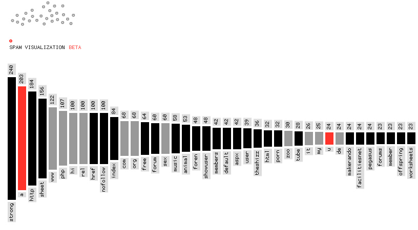
Spamvisualization.net allows for the observation of spam’s inscrutably absurdist prose — all from a comfortable distance from your inbox. It operates on the premise that spam (when divorced from its primary role as unsolicited advertising) = interesting raw data = cool infographics. The site aggregates spam messages into a database and then analyzes their basic quantifiables (i.e.- what words appear and how often, how broad is the message’s distribution, etc.) The sanitized numbers generated from this survey can then be represented in bar graphs, charts, and bubble form.
The “wordscore†visualization, for example, reveals that “strong†is the most frequently occurring word in spam (which in html code parlance means “boldâ€) while “horse†is about midway down the list of frequently-occurring terms (and regrettably, possesses no html meaning.) The “quantitygrid†reveals the size/distribution of spam “campaigns†in the form of tasteful blobs, proportional to the size of the campaign. The spam represented by these anonymous orbs can easily be revealed upon rollover. A cursory survey of the bubble-landscape revealed advertisements for such unexpected products as “discount menopause gum†and “free sex tubes.†Nice!

One Trackback
[…] Spam Infographics (The Anti-Advertising Agency) […]