The journey along Rwanda’s winding mountain roads is a bustling scene rural life, farm work, and commerce dotted with sparse, intermittent signage. In the most densely populated nation in Africa, advertising is thin. There are no shop signs or billboards. The looping eucalyptus and mud brick facades sporadically feature a lone 16″ x 20″ splash of color —very casually placed—which bears the dual message of “this is a shop” and/since “X is available for sale here.”

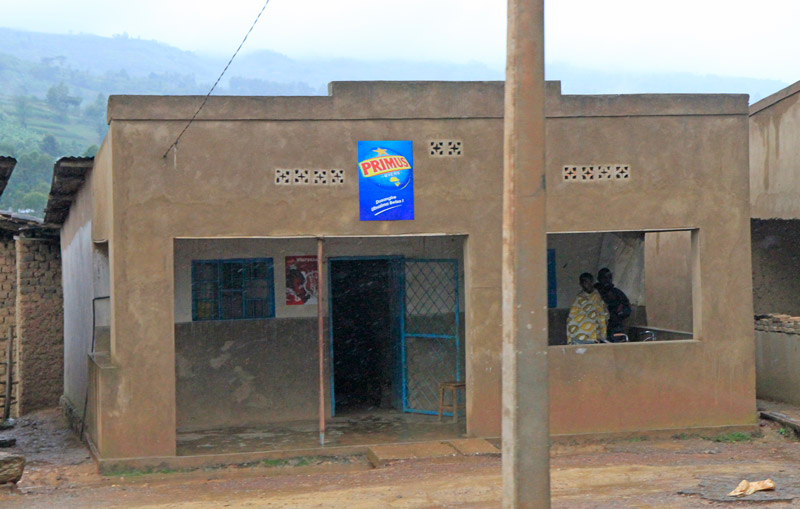
A beer poster on a shop outside of Kigali
The most prevalent of these signs is the blue-hued Primus beer postings, which frequent the storefronts — usually tacked onto the side, next to the door. Their informal treatment makes their display feel compulsory — approximating how a NYC restaurant might treat a department of health certificate. In the western city, the arrangement of ads is much more careful…and even hierarchical (it wouldn’t be amiss to say that they are arranged by money more than they are arranged by people; i.e. the most visible positioning = the most expensive slot.)  In this context, dispassion in arrangement is reserved for the strictly obligatory: the no smoking sign, the choking safety poster, the restroom sign. Refreshingly, all signs seem to get the same treatment in Rwanda.
The Primus beer signs in Rwanda are a strange player here. The sole vestige of western ad aesthetics complete with logotype, spot colors, copyright notice (all alien in this agrarian culture) — they are also utilitarian objects, dutifully pointing to the beer. “The beer is HERE!†This indexical function is immediately at odds with the western advertising’s tendency to disembody the brand from the object. Oftentimes, a NYC billboard will advertise a product that is practically unattainable in terms of the reasonable logistic measures. (Those showy 2003 Target billboards come to mind: the company consumed Times Square with ads before a store was open anywhere near Manhattan…much to popular annoyance.) The Primus ads sit [logically] at the nexus of consumer and beer, brand and product.
How does such a practical arrangement of signage become the exception rather than the rule? Why do these beer signs seem so weird?? For a better answer than can be provided here, I recommend looking at Susan Sontag’s essay, Posters: Advertisement, Art, Political Artifact, Commodity. In this 1970 essay, Sontag examines the assorted postings that cover the western city — distinguishing between the advertisement poster and the public notice.  While “posters†historically arose out of the tradition of the public notice, she considers them notably distinct in “presupposing the modern concept of the public – in which members of society are defined as spectators or consumers.”  Posters actively compete for the consumer: “the values of the poster are first those of ‘appeal’, and only second of information” while public notices “inform” – ostensibly conveying the straight facts on good authority.  The beer posters share qualities of each communication method- straddling Sontag’s definitions (in utilitarian defiance of western ad usage.) Although meant to stimulate commerce (or at least enable it) Rwandan shopkeeps’ deadpan use of the posters to point to the beer makes them function like an informative public notice — the tone of the communication is more akin to signage than appeal. The proximity of the notice to the goods bridges the brand to a physical product. It is a public notice… one that happens to lack the expected civic dimension and instead points to beer.
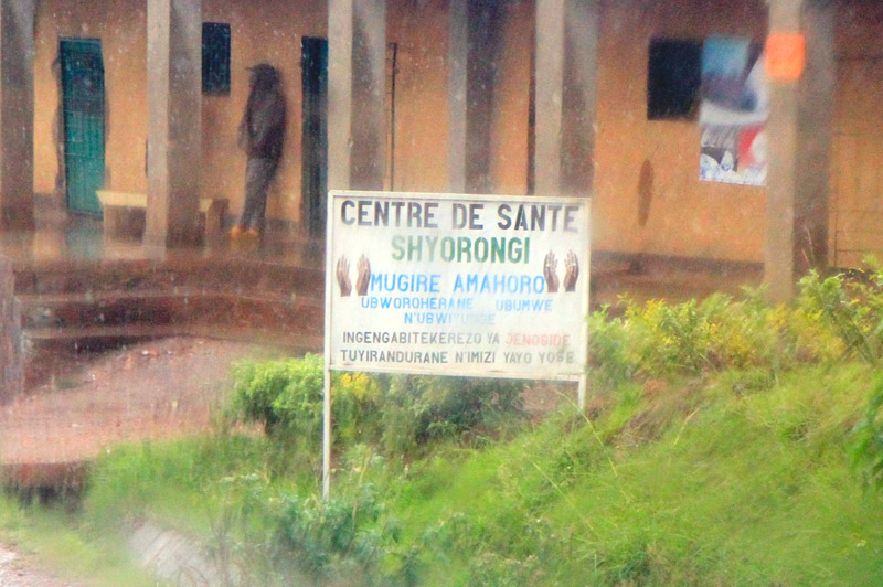
We drive for miles through farm villages without any signage at all – not even beer posters.  At set intervals, a different type of signage emerges as a repeating motif. Sober reminders of the 1994 genocide appear on the side of the road – rendered in uniform block-lettered hand-painted type on standard white posts.  Each sign shows a pair of hands in repose with text that bears the general message of “Genocide: Never let it happen again†(as roughly translated by our driver.) Here is the proper, traditional public notice: the sign with a civic message to a country which has literally hit the reset button on what “civic†engagement means.

To say that Rwandans had no other choice is an understatement — the country’s lone museum, the Genocide Museum, chronicles the ruin of a nation in horrifying detail. However, to say that they’ve had no choice also undermines the immense philosophical and political accomplishments of the people. It is impressive — even to the casual observer. One instantly picks up on a sense of “mass cooperationâ€: drivers yield to cars and pedestrians, strangers engage in polite conversation, Kigali residents excitedly discuss the city’s planned projects as if they were their own. Our driver enthusiastically chats with us about education reform, family planning initiatives, rural housing planning, urban street planning, and the political empowerment of women. There is virtually no crime to speak of. Everyone — right up to the nation’s president— is required to sweep their street once a month. They have more women in their Parliament than Sweden. Fifteen years after hitting “resetâ€, Rwanda is a nation of people wholly dedicated to civic enrichment — they are busy designing their future through policy.

The genocide street signs stand as a reminder of this sentiment — the genocide was a beginning for unity, rather than an end. Rather than serving as an authoritative mandate from an aloof government, its interpretation emanates from the people. It is the people’s sign, a symbol of unity. This is a public-notice-as-monument — reminding Rwanda’s public of their accomplishments and setting the tone for the new generation. The sign’s deadpan format belies the over-arching convictions of a nation singularly fixated on the future.

A more western ad campaign inside the capital city of Kigali…for cooking oil

“Beer here!â€: The Poster and the Public Notice in Rural Rwanda
The journey along Rwanda’s winding mountain roads is a bustling scene rural life, farm work, and commerce dotted with sparse, intermittent signage. In the most densely populated nation in Africa, advertising is thin. There are no shop signs or billboards. The looping eucalyptus and mud brick facades sporadically feature a lone 16″ x 20″ splash of color —very casually placed—which bears the dual message of “this is a shop” and/since “X is available for sale here.”
A beer poster on a shop outside of Kigali
The most prevalent of these signs is the blue-hued Primus beer postings, which frequent the storefronts — usually tacked onto the side, next to the door. Their informal treatment makes their display feel compulsory — approximating how a NYC restaurant might treat a department of health certificate. In the western city, the arrangement of ads is much more careful…and even hierarchical (it wouldn’t be amiss to say that they are arranged by money more than they are arranged by people; i.e. the most visible positioning = the most expensive slot.)  In this context, dispassion in arrangement is reserved for the strictly obligatory: the no smoking sign, the choking safety poster, the restroom sign. Refreshingly, all signs seem to get the same treatment in Rwanda.
The Primus beer signs in Rwanda are a strange player here. The sole vestige of western ad aesthetics complete with logotype, spot colors, copyright notice (all alien in this agrarian culture) — they are also utilitarian objects, dutifully pointing to the beer. “The beer is HERE!†This indexical function is immediately at odds with the western advertising’s tendency to disembody the brand from the object. Oftentimes, a NYC billboard will advertise a product that is practically unattainable in terms of the reasonable logistic measures. (Those showy 2003 Target billboards come to mind: the company consumed Times Square with ads before a store was open anywhere near Manhattan…much to popular annoyance.) The Primus ads sit [logically] at the nexus of consumer and beer, brand and product.
How does such a practical arrangement of signage become the exception rather than the rule? Why do these beer signs seem so weird?? For a better answer than can be provided here, I recommend looking at Susan Sontag’s essay, Posters: Advertisement, Art, Political Artifact, Commodity. In this 1970 essay, Sontag examines the assorted postings that cover the western city — distinguishing between the advertisement poster and the public notice.  While “posters†historically arose out of the tradition of the public notice, she considers them notably distinct in “presupposing the modern concept of the public – in which members of society are defined as spectators or consumers.”  Posters actively compete for the consumer: “the values of the poster are first those of ‘appeal’, and only second of information” while public notices “inform” – ostensibly conveying the straight facts on good authority.  The beer posters share qualities of each communication method- straddling Sontag’s definitions (in utilitarian defiance of western ad usage.) Although meant to stimulate commerce (or at least enable it) Rwandan shopkeeps’ deadpan use of the posters to point to the beer makes them function like an informative public notice — the tone of the communication is more akin to signage than appeal. The proximity of the notice to the goods bridges the brand to a physical product. It is a public notice… one that happens to lack the expected civic dimension and instead points to beer.
We drive for miles through farm villages without any signage at all – not even beer posters.  At set intervals, a different type of signage emerges as a repeating motif. Sober reminders of the 1994 genocide appear on the side of the road – rendered in uniform block-lettered hand-painted type on standard white posts.  Each sign shows a pair of hands in repose with text that bears the general message of “Genocide: Never let it happen again†(as roughly translated by our driver.) Here is the proper, traditional public notice: the sign with a civic message to a country which has literally hit the reset button on what “civic†engagement means.
To say that Rwandans had no other choice is an understatement — the country’s lone museum, the Genocide Museum, chronicles the ruin of a nation in horrifying detail. However, to say that they’ve had no choice also undermines the immense philosophical and political accomplishments of the people. It is impressive — even to the casual observer. One instantly picks up on a sense of “mass cooperationâ€: drivers yield to cars and pedestrians, strangers engage in polite conversation, Kigali residents excitedly discuss the city’s planned projects as if they were their own. Our driver enthusiastically chats with us about education reform, family planning initiatives, rural housing planning, urban street planning, and the political empowerment of women. There is virtually no crime to speak of. Everyone — right up to the nation’s president— is required to sweep their street once a month. They have more women in their Parliament than Sweden. Fifteen years after hitting “resetâ€, Rwanda is a nation of people wholly dedicated to civic enrichment — they are busy designing their future through policy.
The genocide street signs stand as a reminder of this sentiment — the genocide was a beginning for unity, rather than an end. Rather than serving as an authoritative mandate from an aloof government, its interpretation emanates from the people. It is the people’s sign, a symbol of unity. This is a public-notice-as-monument — reminding Rwanda’s public of their accomplishments and setting the tone for the new generation. The sign’s deadpan format belies the over-arching convictions of a nation singularly fixated on the future.
A more western ad campaign inside the capital city of Kigali…for cooking oil